Converting Industry Dive's support page to CSS Grid
How I used CSS Grid to implement a modular design on the support page.
Development| Posted October 8, 2018
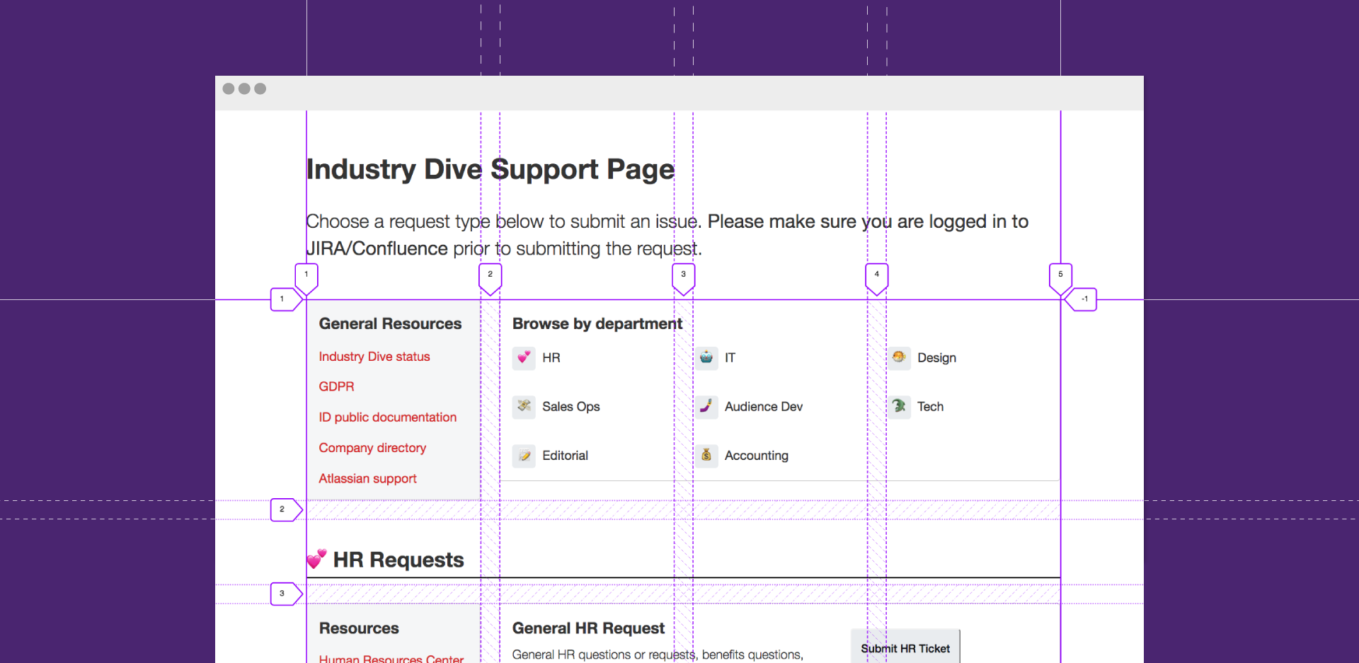
Industry Dive triages individual issues and requests through an internal support page. The initial page goal was to provide a central location to submit requests for technical issues, but it quickly became a hub for all requests for all departments.
New goals and requirements
Tony Bagdon, a technical project manager, and Ian Hougland, head of IT, found that employees were submitting tickets that internal documentation could answer. They wanted to provide resources to proactively solve common problems and prevent unnecessary requests.
The new vision was for this page to be a post-sign to point people in the right direction. While the design was conducive to the original requirements, it did not serve the new goal of guiding employees to resources.
Redesigning the page
There were a few ways design could accommodate these new requirements. It was tempting to find a fancy solution involving tabulated data or multi-page sites. But these options would have lost sight of the support hub’s initial simplicity, which grew its popularity among employees. The page needed to remain easily navigable and answer people’s questions fast.
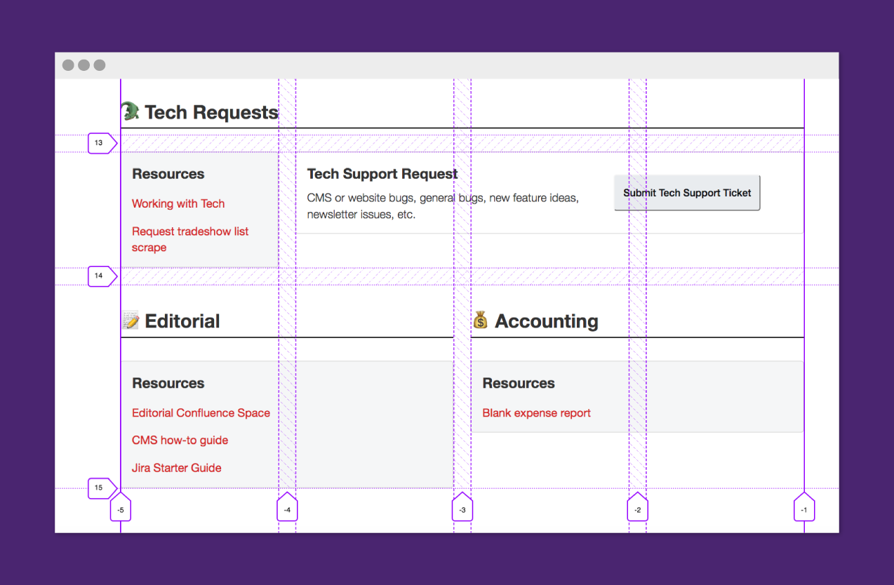
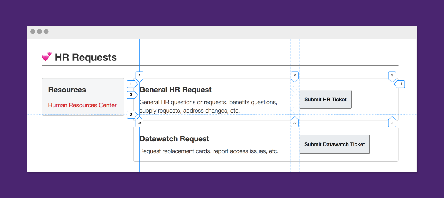
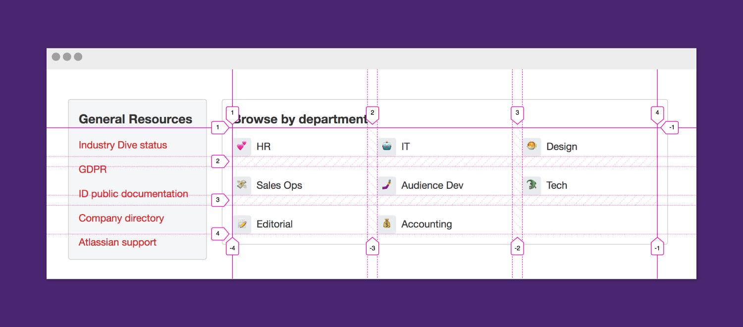
For this reason, I decided to maintain the basis of the page and integrate a more modular structure. This meant adding a scalable resources section to each department, as well as a general resources section at the top of the page. I also included new navigation that would allow employees to get where they wanted to go faster as the page grew in length.
CSS Grid
After looking at the final mocks, I realized that this would be a great opportunity to use CSS Grid. The design was modular and the page is an internal-facing tool, so browser support is not as high of a priority. I started by taking my best guesses at using grid based on its formal documentation. I then took Wes Bos’s CSS Grid course which helped me clean the code and implement best practices. The design ended up translating into three distinct, defined grids.
The Main Grid
The first was the main grid which divided the page into four columns, using “grid-template-columns”. The “align-items: start” ensured that the column height would only be the size of the defined content. This was useful for the resources boxes that I didn’t want to always span the full height of the row.
.container {
	align-items: start;
	display: grid;
	grid-template-columns: repeat(4, minmax(0,1fr));
	grid-gap: 1.5rem;
}
The Requests Grid
The next grid I defined was the requests bars. The “justify-items: start” attribute set the width of the buttons to the width of the content instead of the full width of the column. I then placed the button in the middle between both text rows so it was vertically aligned. This was done by spanning all the rows and then “align-self: center”. While this layout could have been done with flexbox, I wanted to continue experimenting with grid and how it translates to different layouts.
.requests {
	display: grid;
	justify-items: start;
	grid-template-columns: 1fr 250px;
	grid-column-gap: 1.5rem;
}
.requests button {
	align-self: center;
	grid-row: 1/3;
	grid-column: 2;
}
The Departments Grid
The final grid was for the department navigation at the top of the screen. The “grid-template-columns” property allows for as many columns that will fit at a minimum width of 165px each. By defining it like this, the number of columns is completely responsive to the screen width. Instead of the one-column layout often found on mobile, this property allowed for two if the screen width permitted.
.departments {
	display: grid;
	grid-template-columns: repeat(auto-fit, minmax(165px, 1fr));
	grid-gap: 1rem;
}
Overall, this project was an experiment in CSS Grid and creating modular designs. There are a lot of ways this layout could have been done with grid. I am still experimenting with best practices and am interested to hear about different approaches!