Branding a design exhibition
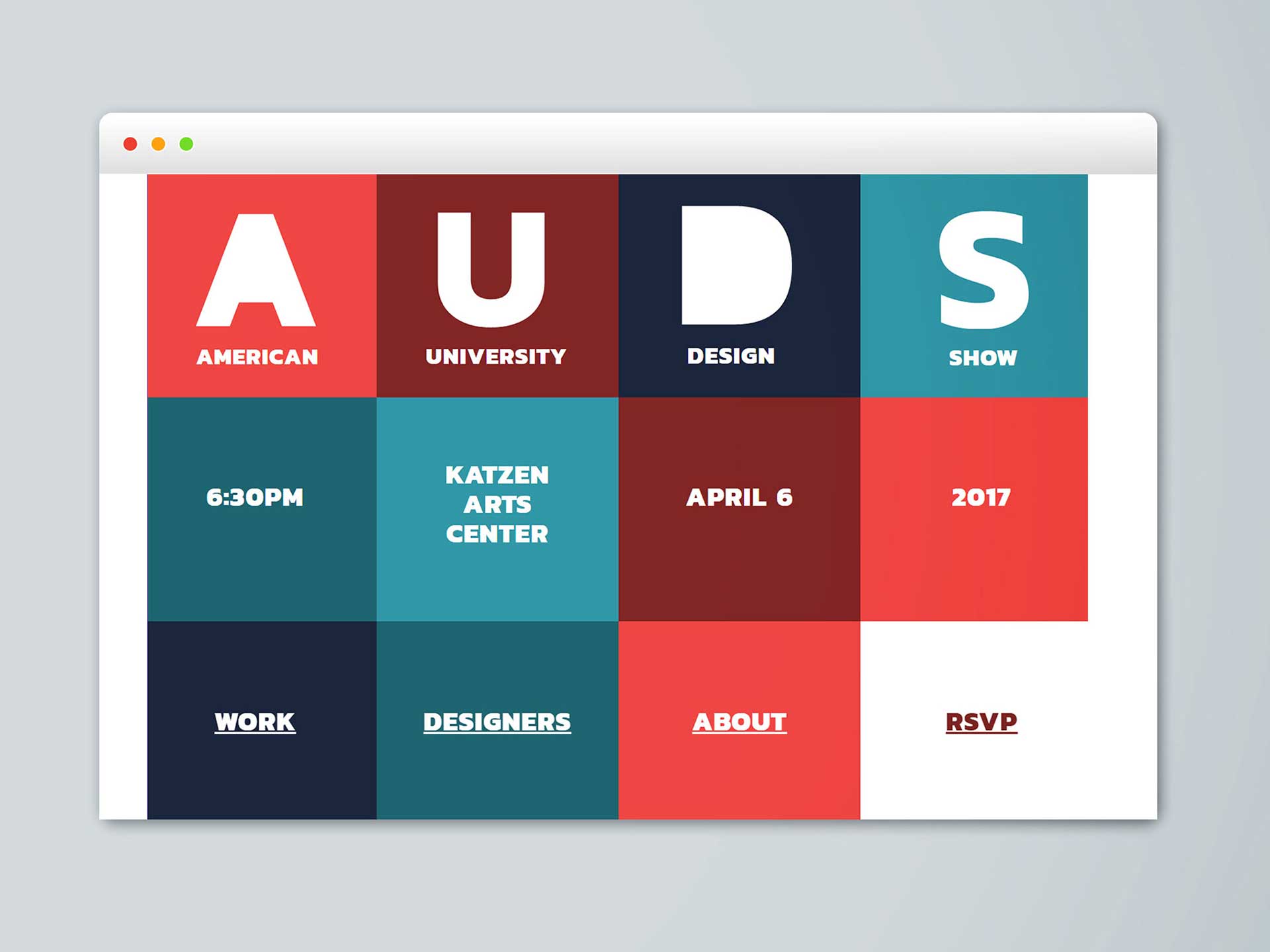
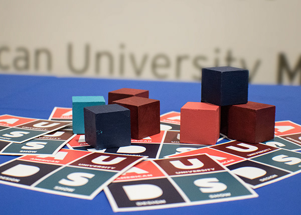
My concept for the 2017 AU Design Show was to reveal the talent produced from the American University Graphic Design Department. The small size of the program is not reflective of the creative, high quality work its students create. My concept for the show, “revealing the obscured”, utilized a strong color palette, 3D cubes and cut outs.
Focused on showcasing our department’s talent, I thought of different things that reveal the unexpected. My inspiration was the 15-number sliding puzzle game that reveals its background as the pieces move. The design of the game lends itself to using squares and I chose a strong color palette to match the straight lines. The final concept uses tiles with cut outs to further allude to revealing the obstructed.
Marketing
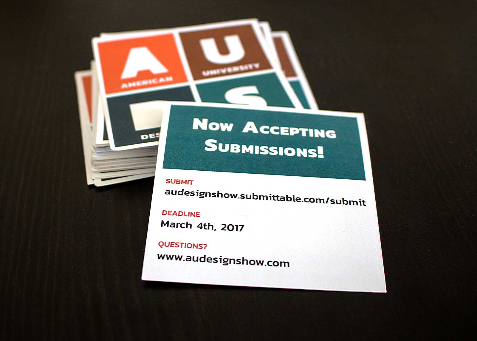
To advertise and recruit students to submit to the show, we created square cards to hand out in the graphic design classes. We also utilized Instagram campaigns to encourage submissions and event attendance. We later created a Facebook event to invite students, alumni and employees. On top of that, and because this is a great recruiting event, we emailed design firms and organizations in the area inviting them to attend.
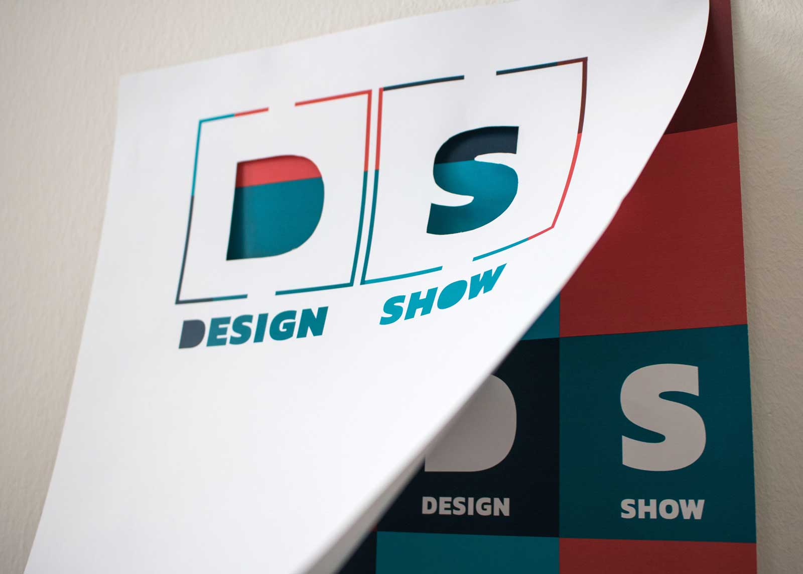
Two weeks before the event, we hung up promotional posters around campus. The posters were two-layered with a die cut on the top and the date and time on the bottom. The design encouraged the public to interact with the poster to reveal the time and location of the event.
Website
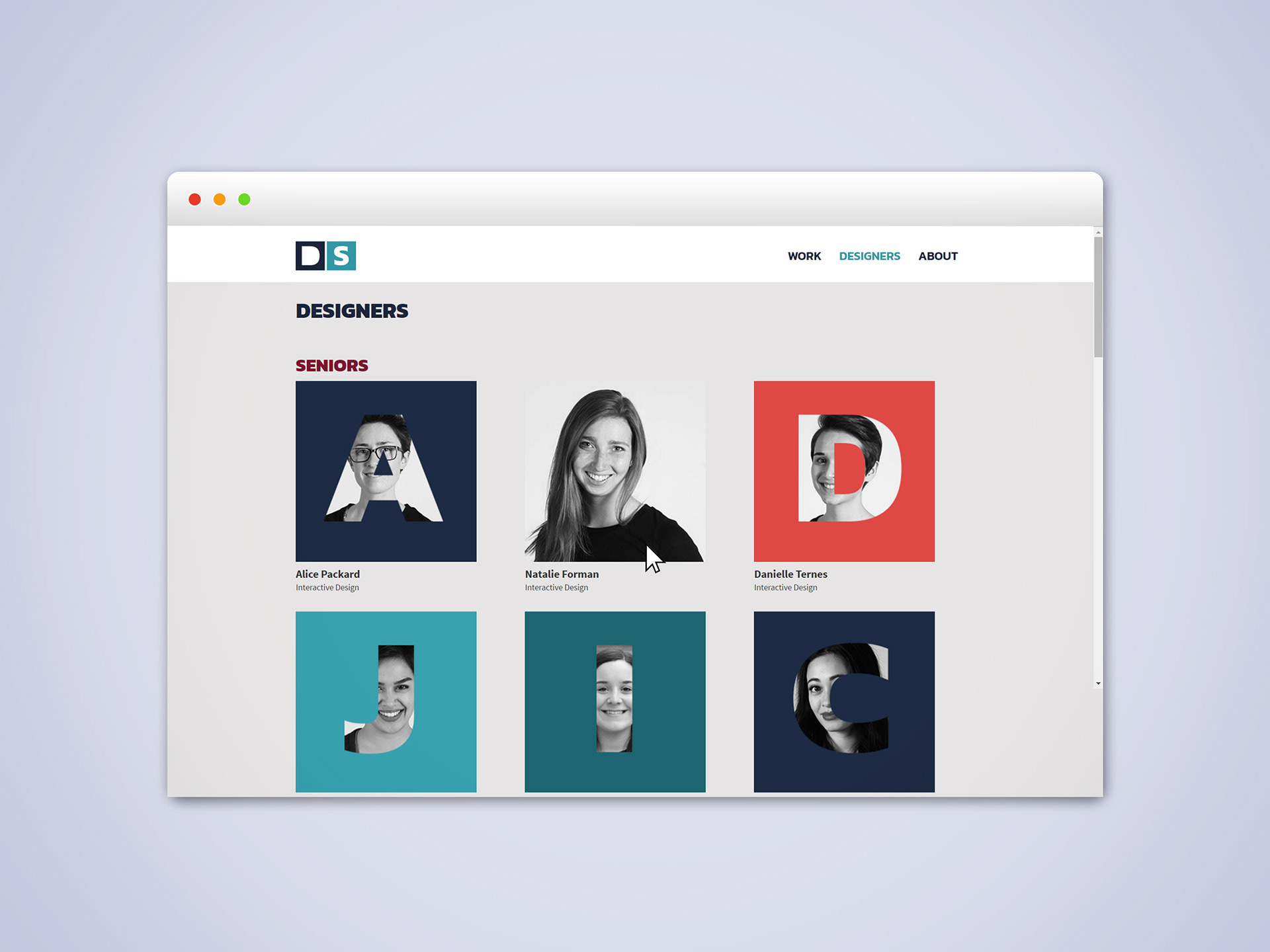
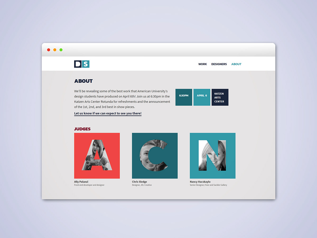
The event website promotes the event and announces the selected student designers. I designed the landing page using unconventional patterns; the page is covered in large square navigation blocks. The student feed page mimicked the revealing motif as the first letter of each student’s name obstructed their faces except on hover.
The event
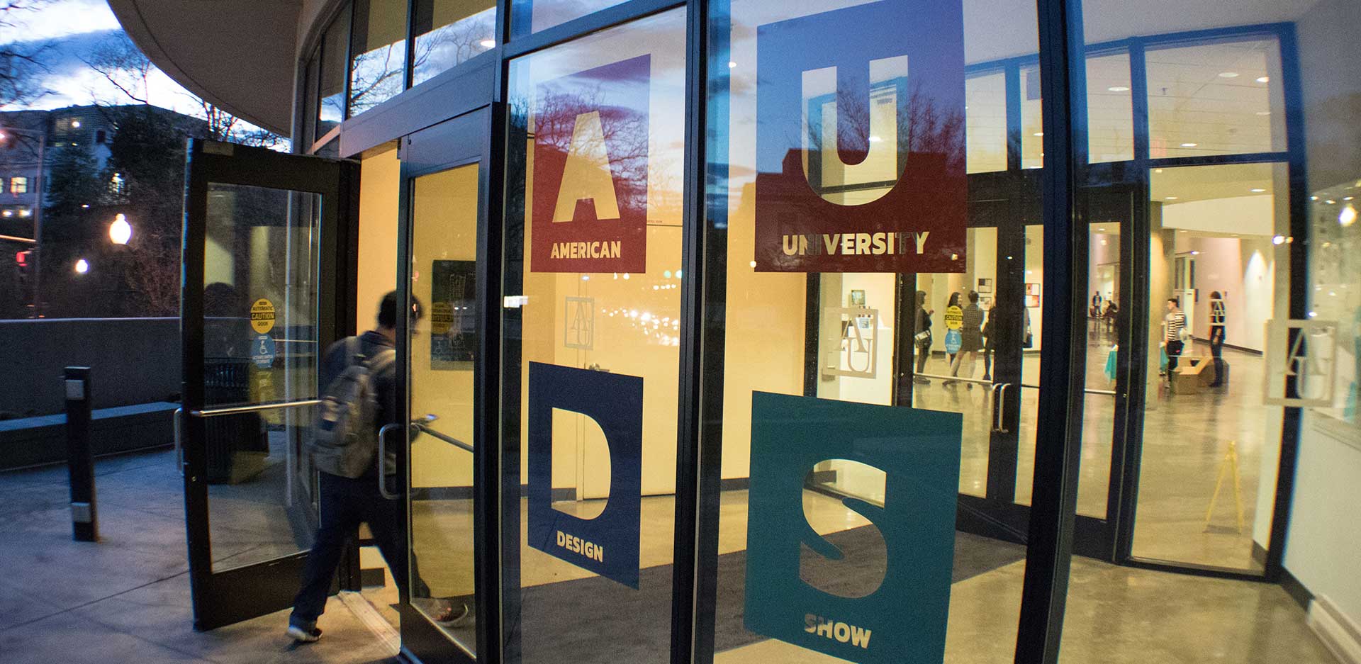
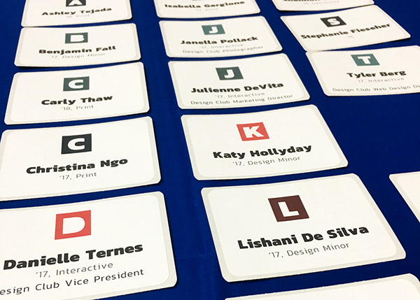
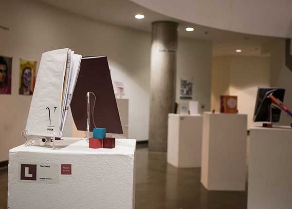
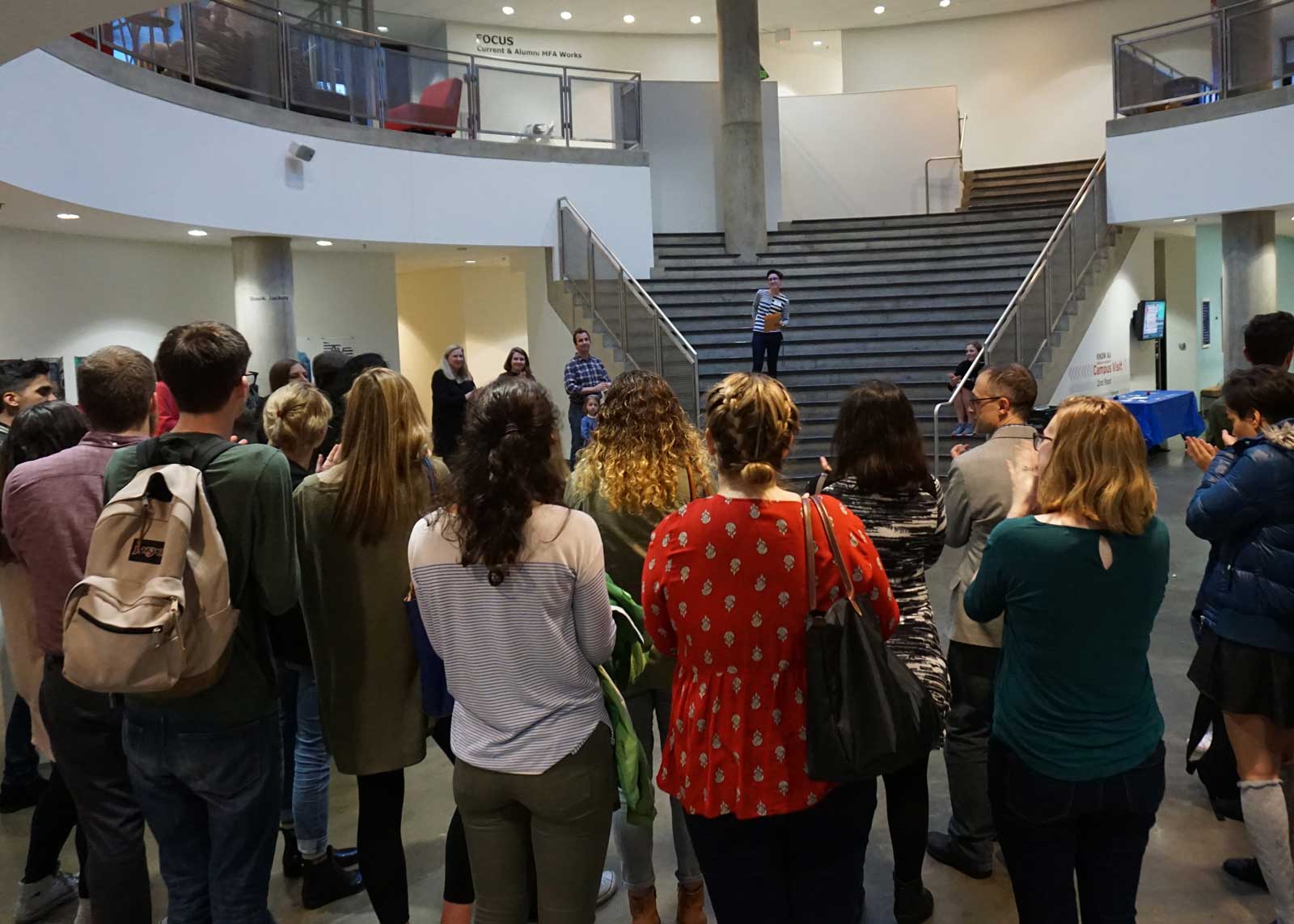
The exhibition design was the culmination of our hard work. Attendees were greeted with large window decals of the exhibition logo on the glass doors before entering the rotunda. Once inside, each student artists had a prominent letter block on their name tag matching the label on their chosen artwork. There were also Painted cubes scattered between the artwork displays for visual interest. Finally, attendees could take home stickers of the show logo. Each of these elements contributed to an immersive and cohesive experience.
Installation piece
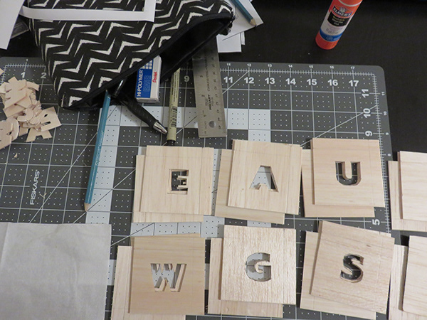
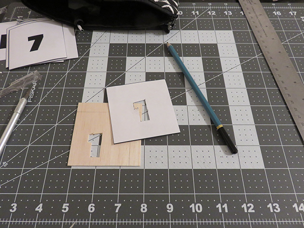
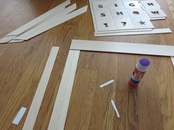
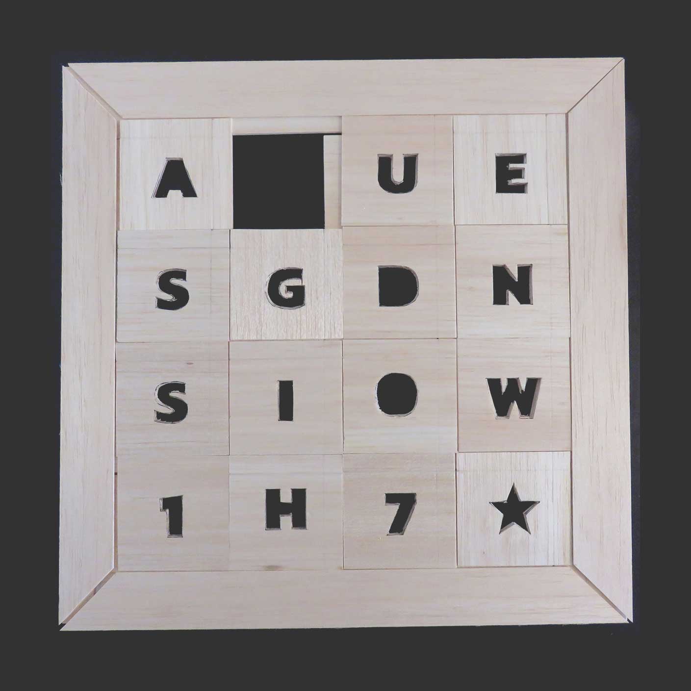
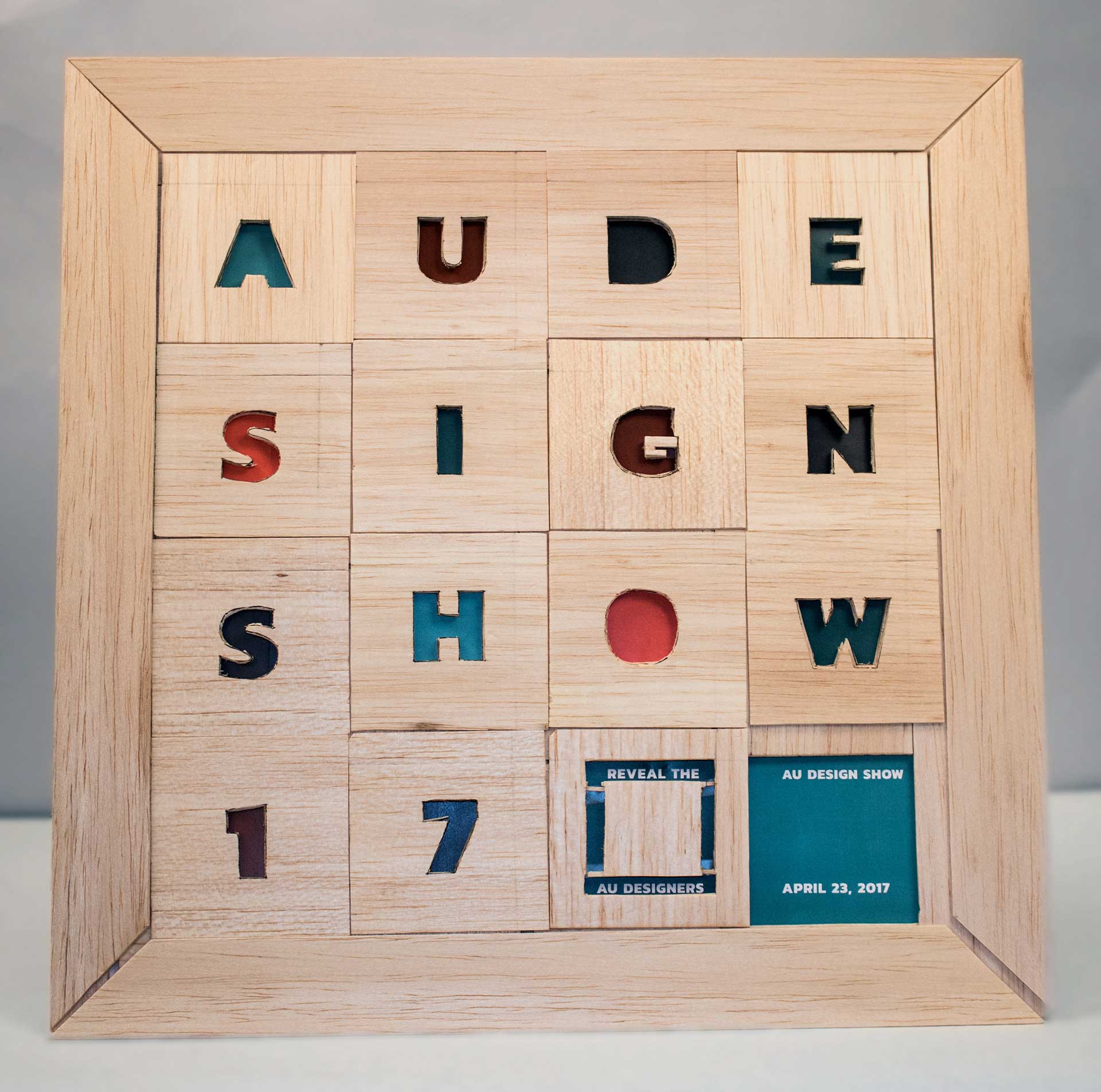
While it did not make it to production, I designed an installation piece for the show. It mimics a 15-number slider game with moving wooden tiles. The hope was for it to be 5 ft x 5 ft and stand in the middle of the rotunda during the event. The attendees could then move it around and reveal the student artists’ names. I created a small prototype of what it would have looked like.
The team
Thank you to the amazing design club as they made this show happen. Special thanks to our faculty advisers Anna Leithauser and David Ramos for their support and to Janella Polack for taking the student headshots.
- President - Alice Packard
- Vice President - Danielle Ternes
- Director of Marketing - Julienne DeVita
- Director of Web Design - Tyler Berg
- Art Director and Treasurer - Natalie Forman (me!)